Fonts of Mystara’s Maps
Over the decade and a half and more of Mystara’s official publication, a large selection of fonts were chosen for use in the setting’s maps. This appendix aims to catalogue and present examples of their use, for fun as well as for future reference.
Note that only appearances of fonts on geographic maps — those within the scope of the Atlas of Mystara — are taken into account here. Essentially, this is a map-focused version of my previous Mystara Font FAQ.
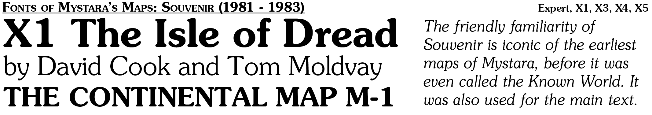
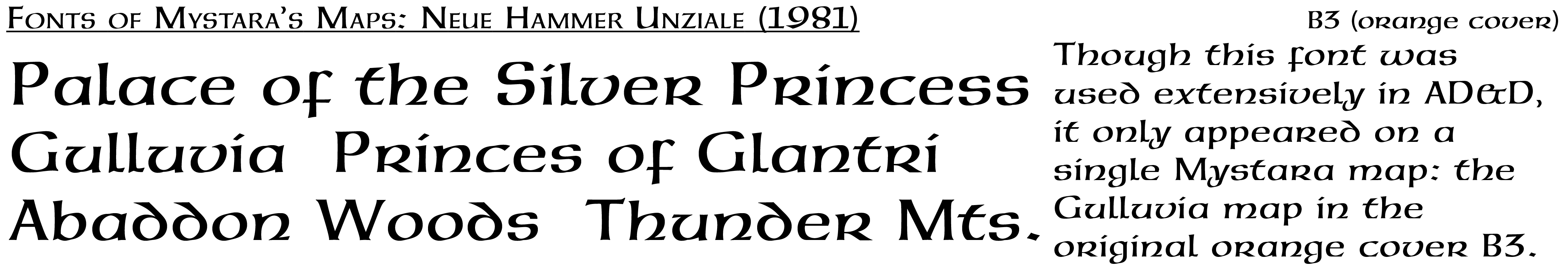
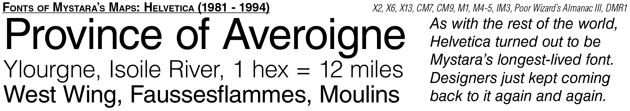
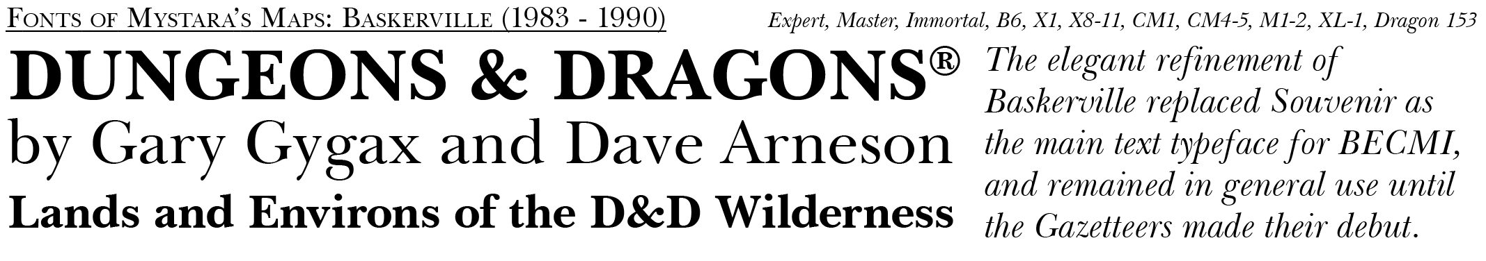
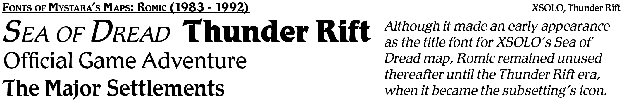
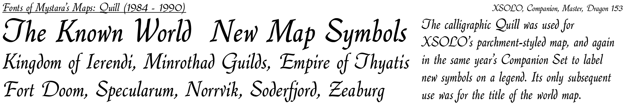
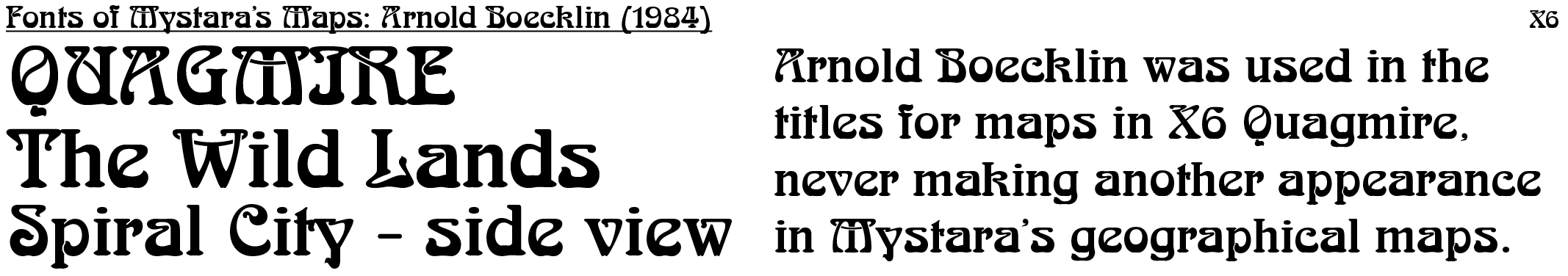
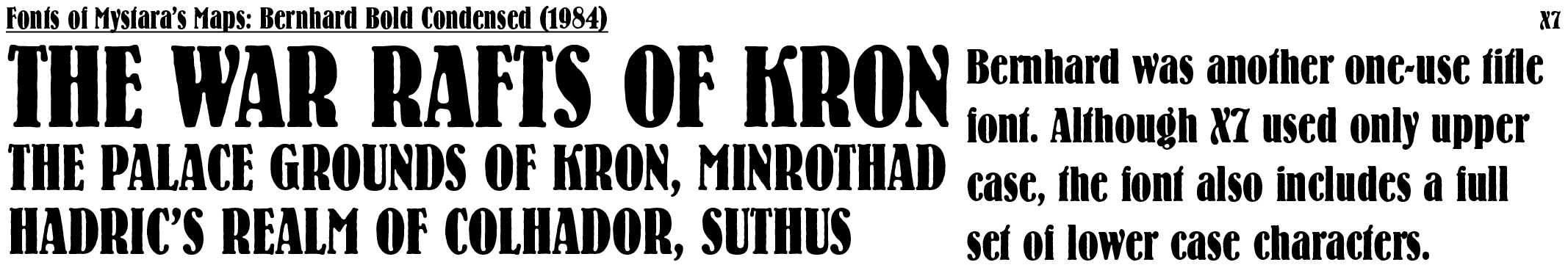
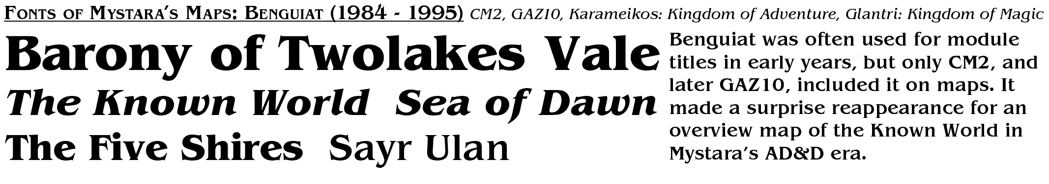
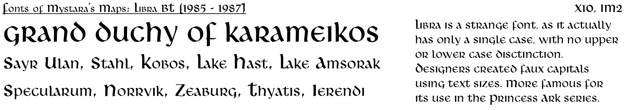
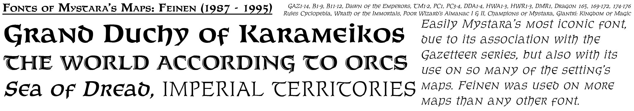
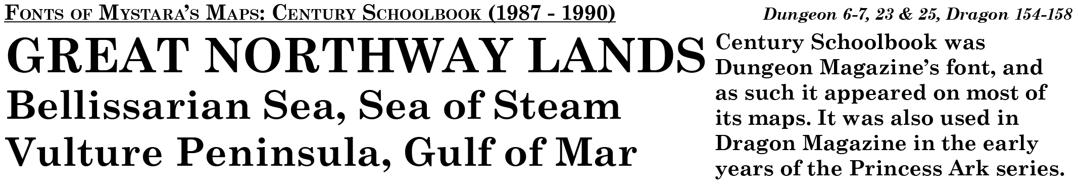
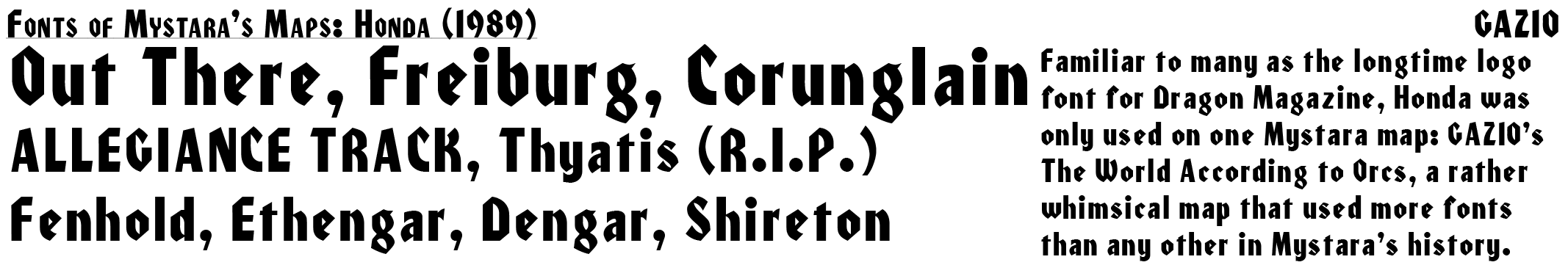
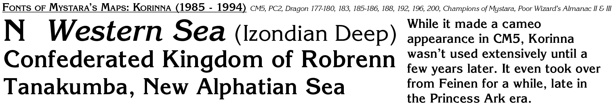
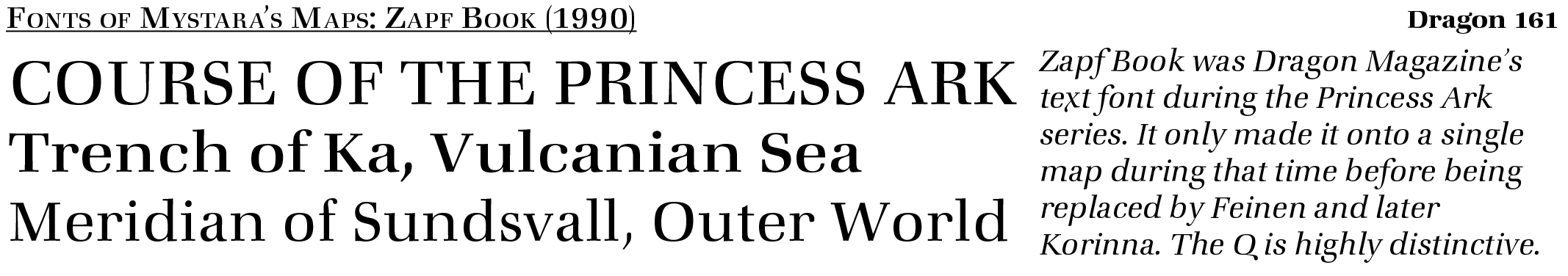
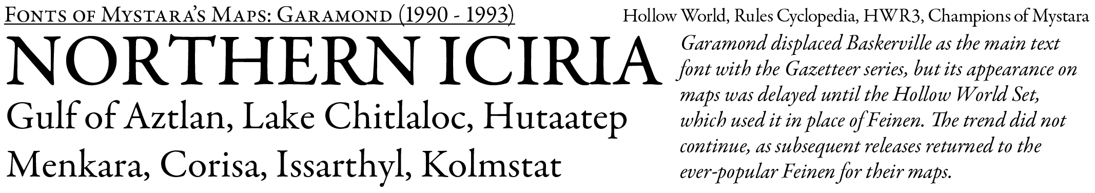
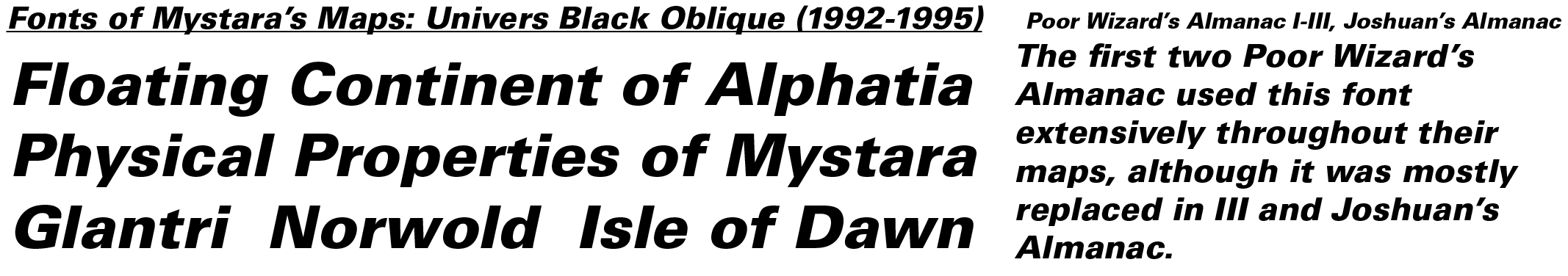
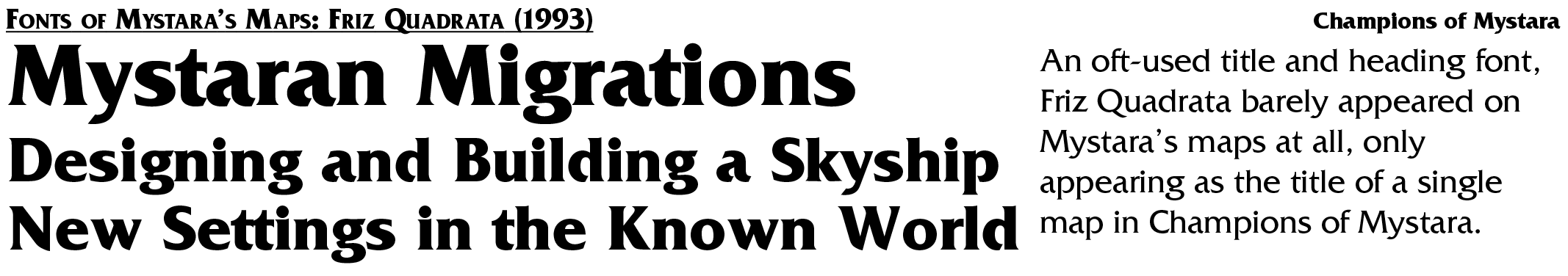
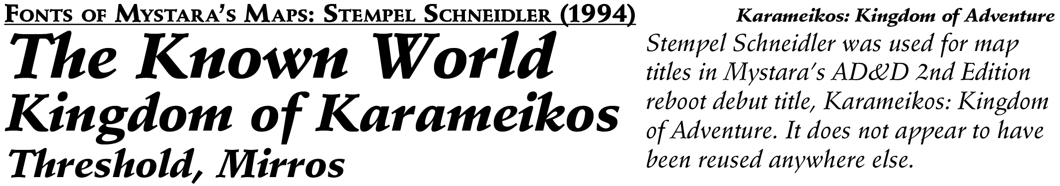
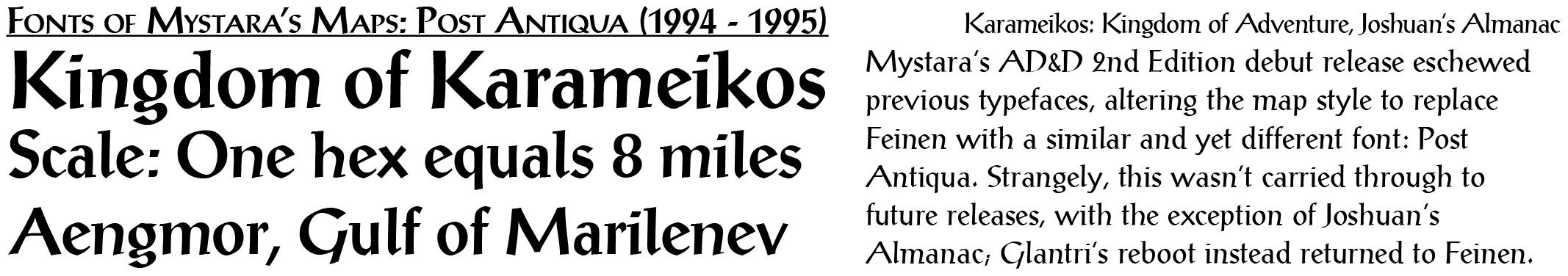
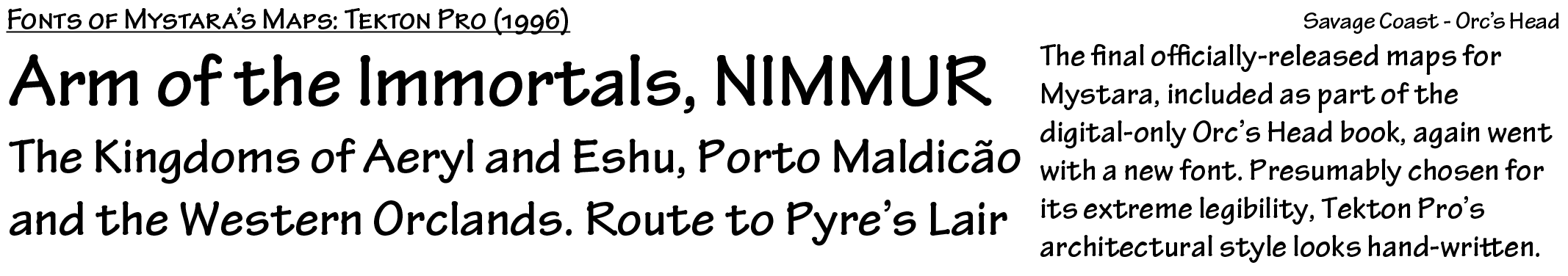
Each font is presented as a plate, with the name and dates used in the top left; the products whose maps used the font in the top right; samples mostly drawn from actual usages in maps at the bottom left; and a short commentary at the bottom right.
Fonts are presented in roughly chronological order of appearance.
Honourable mentions go to Futura and Franklin Gothic Condensed, both of which appeared as keyed numbers in early maps.
Update, 16th May 2021 — Added Neue Hammer Unziale from B3’s Gulluvia map.
Update, 30th January 2026 — Adjusted Helvetica and added Univers Black Oblique.
If you have any comments or corrections, please don’t hesitate to chime in!
26 November 2021 @ 9:03 am
Found another one: Korinth Serial Bold for X9: Savage Coast cover.
26 November 2021 @ 8:12 pm
That’s Korinna. This list concentrates exclusively on maps, ignoring the title and text fonts used in the books themselves. Korinna was used as the standard title font for a long time, though it only appeared on a few maps early on (notably CM5). It became the standard map font in later years, beginning in Dragon partway through the Princess Ark series, and continuing in Champions of Mystara and the second and third Poor Wizard’s Almanacs.
11 January 2025 @ 7:29 am
Do you have a list of the font sizes you use for your replica/remade maps please? e,g, 12 for a City name.
25 April 2025 @ 9:48 pm
Sorry, I didn’t see your question until now. I’m afraid I don’t have such a list. I used to many years ago, but the sizes got a bit wonky when I started exporting my maps first at 125%, then at 300 DPI. And I never got back to it…