
GAZ5 Elven Migrations
This map was clearly based on an extract from the Master Set world map. It has slightly different styling, and leaves out some of the smaller islands, but otherwise the coastlines are very much the same as the original, though everything is rotated 0.5º clockwise compared with the original world map.
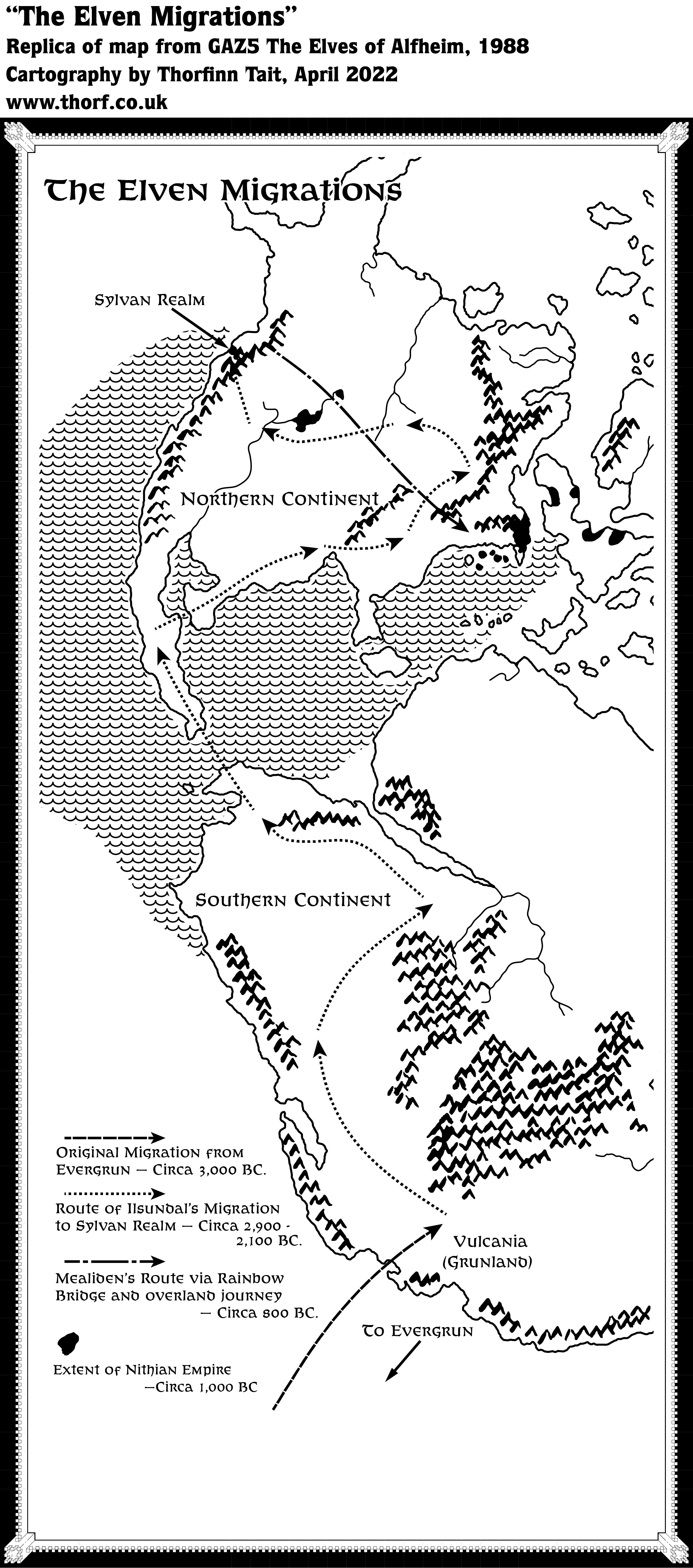
The content of the map is very interesting, as it provides a view of the movement of populations through history — one of the first such maps to appear for Mystara, but certainly not the last. Aside from the movements of the elves, it also gives a very useful overview of the extents of the ancient Nithian Empire.
Replica Map (April 2022)
Sources
- GAZ5 The Elves of Alfheim (1988) (PDF at DriveThruRPG)
- Page 6 map (Cartography by Dave Sutherland, Dennis Kauth)
Chronological Analysis
This is Map 84. It was published in March 1988. The updated version of this map has not yet been released. See also Appendix C for annual chronological snapshots of the area. For the full context of this map in Mystara’s publication history, see Let’s Map Mystara 1987.
The following lists are from the Let’s Map Mystara project. Additions are new features, introduced in this map; Revisions are changes to previously-introduced features; Hex Art & Fonts track design elements; and finally Textual Additions are potential features found in the related text. In most cases, the Atlas adopts these textual additions into updated and chronological maps.
Coming Soon


2 April 2022 @ 12:05 am
I don’t see the Nithian extents (?)
2 April 2022 @ 7:47 am
Good catch. It seems in my haste to post I accidentally posted an older version of the file. Sorry about that! It’s fixed now.
2 April 2022 @ 12:28 am
Hi Thorf
I agree on itself this map is interesting.
Maybe a grey tone on land and/or on water (no waves) would make this clearer.
Another minor flaw is the length of the arrows towards/from Evergrun. When resembling these with the global maps (where Evergrun should have been and later fanon was placed/created as such) the arrows here seem to suggest a location further southwest
The waves are also somewhat disturbing, and if not used to point the Nithian aquatic extent, make the map somewhat messy, and understandible the original artist did not use these further on the map.
What I truly liked about this map was not only the elven course, but it was the first decent description of CM7’s Location of the Sylvan Realm.Interesting also to see, that where arrows end, in canon then and later Elven settlements have been placed (Vulcania-Vulcanian Elves, Davanian Great Izondian Desert-South-East-North- Unknown locations??, arm Immortals-Ee’aar, Savage Coast-Elves, Sind Desert-Graakhalia, Glantri-Belcadiz, Central Brun-unknown, West Brun/lakes-unknown, Sylvan Realm, Alfheim.
It does NOT hold however the Alphatian Elves(DotE), and the Sea Elves(PC3 Sea People) and that is a pity
I feel now as if I am degrading the whole map.
Sorry I am really not intending to make you feel bad. The omission was in the map original as well, and you made a perfect replica, holding these omissions/flaws as well.
2 April 2022 @ 8:04 am
It was my mistake posting an incomplete version without the Nithian extents. Sorry about that!
But you do have a point about the map being pretty strange. For me, the weirdest thing is the wave pattern, and the way it only covers a small part of the map’s seas. I’m not sure why they chose to do that — perhaps they thought that the distinction between land and sea was not enough, but didn’t want to cover the whole sea with waves?
Clearly the map was designed using only black and white, which is always a difficult proposition. When I come to deal with it in my Let’s Map Mystara project (quite soon I hope!), I will certainly add some colour and clean it up a lot.
By the way, the situation with Evergrun is even worse than you describe, as in fact the arrows point to areas that are completely off the edge of the map! They are not just outside the area of the Mollweide grid in my georeferenced world map, but actually off the edge of the original Master Set map, too.
Great point about the future development with the migration stops. I hadn’t noticed that before.
2 April 2022 @ 9:21 am
Thanx Thorf
I know for a fact the waves come from a decal sticker used for garden designers (I used these myself those years doing gardenarchitecture long ago doing that study before I went studying for teacher).
Mostly these were A4 or A5 in size, and normally you had to gut a shape out of it. As it was semi translucent you could draw a shape from a pattern underneath and then cut , and paste by stickering it on the art. Copy, and nobody would be the wiser…unless they did use this stuff themselves (like me ;p). As this rarely is done perfectly fitting, it explains the empty adges close to islands, or coasts.
As the material is limited(and even those days not cheap), it could be a remnant, or there just wasn’t enough left to do the rest.
In Gardeningdesign we also learned that doing all the surface with texture, the map would become ‘too heavy’, so that might also have been a deliberate decision to not place water all over the water areas.